Lately, we’ve been collaborating with some hip biologists who do something called pangenomics, which is like regular genomics but cooler. In regular genomics, you sequence each organism’s genome by aligning it to a reference genome that somebody previously assembled at great cost. In a sense, the traditional view models all of us as variations on a Platonic ideal of Homo sapiens. Pangenomicists instead try to directly model the variation among an entire population. Instead of aligning reads from N individuals against one common reference, the goal is to mutually align each of the N against each other. This all-to-all comparison, they tell us, is the key to understanding a population’s diversity and revealing subtleties that are undetectable with the traditional approach. But it also scales up the computational cost for every computational step in a genomic analysis pipeline—which aren’t exactly cheap even in the traditional, reference-based mode.
A pangenome variation graph is the data structure these folks work with. It models the genetic sequences that multiple individuals have in common and how they differ. The graph’s vertices are little snippets of DNA sequences, and each individual is a walk through these vertices: if you concatenate all the little DNA sequences along a given walk, you get the full genome sequence for the individual. Here’s a picture of a tiny fake graph I made, drawn by the vg tool made by some of our collaborators:

Hilariously, vg picked the 🎷 and 🕌 emojis to represent the two walks in the graph, i.e., the two individual organisms in our little population. (And GraphViz has made something of a mess of things, which isn’t unusual.) You can see the 🎷 genome going through segments 1, 2, and 4; 🕌 also takes a detour through segment 3, which is the nucleotide sequence TTG. Just to make things a little more fun, these walks pass through each segment directionally: either forward, yielding the DNA sequence you see written in the node, or backward, yielding the sequence’s reverse complement. That’s what’s going on with segment 4 here: both paths traverse it backward.
The pangenome folks have a standard file format for these variation graphs: Graphical Fragment Assembly (GFA). GFA is a text format, and it looks like this:
S	1	CAAATAAG
S	2	AAATTTTCTGGAGTTCTAT
S	3	TTG
S	4	CCAACTCTCTG
P	x	1+,2+,4-	*
P	y	1+,2+,3+,4-	*
L	1	+	2	+	0M
L	2	+	4	-	0M
L	2	+	3	+	0M
L	3	+	4	-	0M
This GFA file is the variation graph I drew above.
Each line declares some part of the graph.
The S lines are segments (vertices);
P is for path (which are those per-individual walks);
L is for link (a directed edge where a path is allowed to traverse).
Our graph has 4 segments and 2 paths through those segments, named x and y.
(Also known as 🎷 and 🕌 in the picture above.)
There are also CIGAR alignment strings like 0M and *, but these don’t matter much for this post.
The most interesting part is probably those comma-separated lists of steps in the path lines, like 1+,2+,4- for the x path.
Each step has the name of a segment (declared in an S line) and a direction (+ or -).
All our segments’ names here happen to be numbers, but the GFA text format doesn’t actually require that.
A Slow, Obvious Data Model
How would you represent the fundamental data model that GFA files encode? You can find dozens of libraries for parsing and manipulating GFAs on GitHub or wherever, but those are all trying to be useful: they’re optimized to be fast, or specialized for a specific kind of analysis. To understand what’s actually going on in GFA files, a genomically naive hacker like me needs something much less sophisticated: the most straightforward possible in-memory data model that can parse and pretty-print GFA text.
Anshuman Mohan and I made a tiny Python library, mygfa, that tries to play this explanatory role. Here are pretty much all the important data structures:

A Graph object holds Python lists and dictionaries to contain all the segments, paths, and links in a GFA file.
Maybe the only semi-interesting class here is Handle, which is nothing more than a pair of a segment—referenced by name—and an orientation (+ or - in the GFA syntax).
The mygfa data model is ridiculously inefficient.
That’s intentional!
We want to reflect exactly what’s going on in the GFA file in the most obvious, straightforward way possible.
That means there are strings and hash tables all over the place, including where it seems kind of silly to use them.
For example, because handles refer to segments by name, you have to look up the actual segment in graph.segments.
Like, if you want to print out the DNA sequence for a link’s vertices, you’d do this:
print(graph.segments[graph.links[i].from_.name].seq)
print(graph.segments[graph.links[i].to_.name].seq)
While mygfa is the wrong tool for the job for practical pangenomics computations, we hope it’s useful for situations where clarity matters a lot and scale matters less: learning about the domain, exploratory design phases that come before high-performance implementations, and reference implementations for “real” pangenomics software.
As Slow as Possible
Anshuman took this “slow and steady” approach a step farther and used mygfa to implement a slew of pangenomic analyses. We call the result slow-odgi, because it’s a worse version of odgi, an actually good pangenomic toolkit that our collaborators wrote in C++. Our slow-odgi tool currently implements 12 of odgi’s 44 commands. We have an elaborate differential testing setup that checks, for a bunch of real input GFA files, that odgi and slow-odgi output byte-for-byte identical results.

Slow-odgi is just way, way slower.
This plot compares the running time for odgi paths and slow_odgi paths on 3 very small GFA files (295 kB, 1.0 MB, and 1.6 MB).
Odgi is sort of cheating here because it works on an optimized binary representation of the GFA file, and we’re not counting the time to do the conversion here, whereas slow-odgi has to parse that text format you saw at the top of this post.
For that and many other reasons, slow-odgi is more than 10× slower, even for these little GFAs.
In exchange, it’s also way shorter.
Here’s the code for the paths command that just extracts a list of the paths in a graph, in slow-odgi and then in odgi:
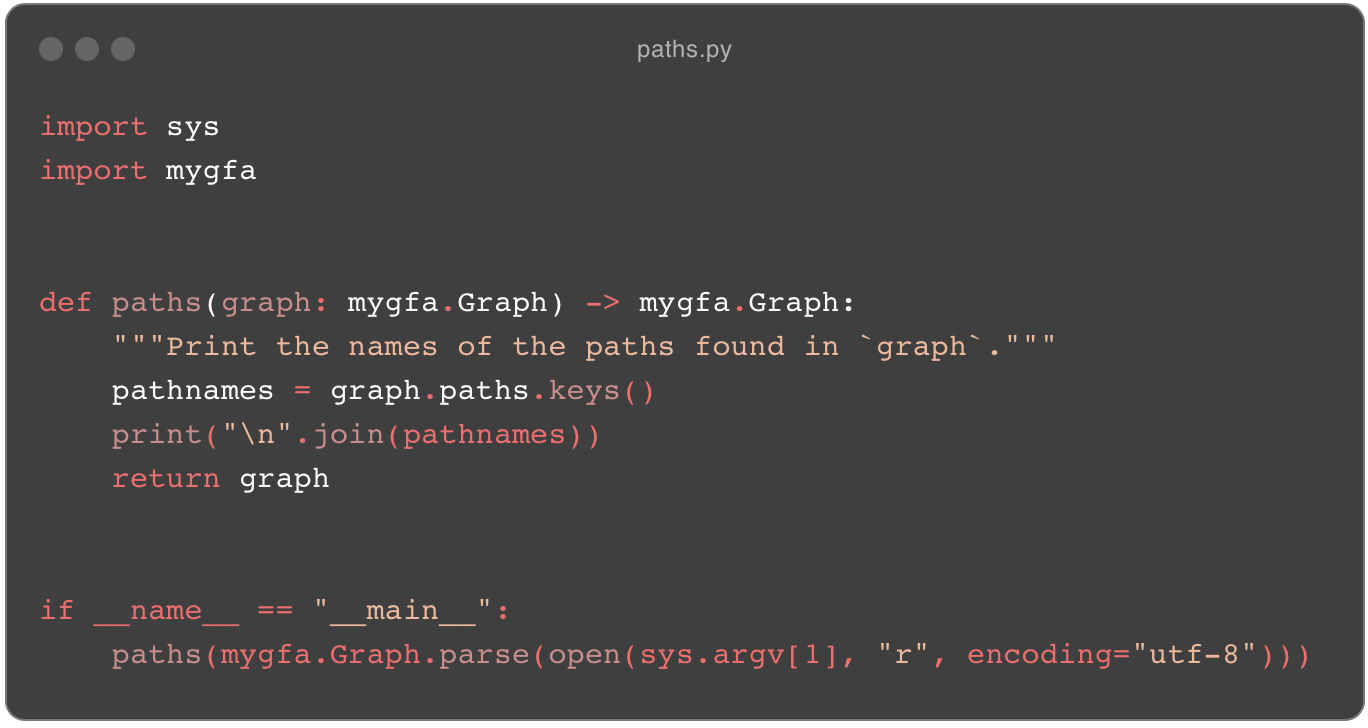
paths.py from slow-odgi.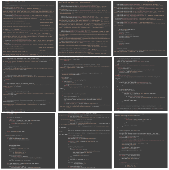
paths_main.cpp.This is a completely unfair comparison because odgi paths has many more features and is actually optimized; slow_odgi paths does only one obvious thing, and it does it slowly.
But painfully obvious reference implementations were exactly what we needed to understand what better implementations could look like.
I’ll write about a new, fast data representation for GFAs in a follow-up post.