What is a Circle Menu?
We've all seen a lot of menus in our lives. Restaurant
menus, a TV Guide movie listing or a clothes-rack at the mall. Menus also exist
in the computer world. However, in Graphical User Interfaces the primary type of
menus are the pull-down and tree menus, both of which are a variation on the
same concept: a list. But as with many a paradigm in computer science, I believe
that they should make way for a better menuing system: the Circle
Menu.
|
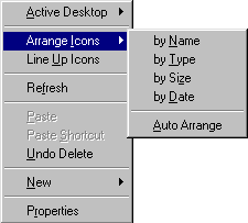
Pull-down Menu |
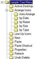
Tree Menu |
 |
 |
"So what's wrong
with the normal menu's?", you ask, "Don't they do their job just fine?" Well,
yes and no. Of course, list-based menus are a good idea. The fact that the menu
items are arranged one below another, like text in a book, makes it easy to read
through the entire menu while looking for what you want. However, once you've
grown familiar with the menu, you already know where the options are so you
shouldn't need to read them to get to what you want. Unfortunately this is not
the case with list-based menus. You always have to scan through all the options
as you move your mouse down to the option of your choice. If you didn't look
then you'd most likely miss your selection and choose something completely
different. Why? Because moving your hand a precise distance without looking is
not a natural motion. We just don't do that in real life. So why are list-based
menus set up like that? Simple, it's because they were created in the days when
the keyboard was the primary tool to use with menus and it made a lot of sense
to use the up and down keys to walk up and down a menu. Today the mouse has
become our primary menu selection tool. But our menus haven't changed, forcing
us into an unnatural and therefore imprecise hand motion. It would make a lot of
sense if the user had to use a more natural gesture to make their mouse
selection.
Another problem is that in a list-based menu, the options on top are a lot
closer to the mouse than the options on the bottom. This doesn't make much
sense. It would make a lot more sense if all the menu options were the same
distance away from the mouse. The only way to fulfill the second
requirement is to put the menu options in a circle around the mouse. This has
the natural side-effect of fulfilling the first requirement: the motion needed
to select the menu options is the movement of the hand in a given direction,
which is much more precise than moving it a certain distance. Ok, ok, so it does
make some sense but is it actually more usable?
Lets run an experiment. Bring
up a menu that you've used many times before. You know the menu, and you know
what you want to find there. Can you make your selection without looking at
the menu? Of course not. Unless you have perfect precision you'll never manage
to move the mouse down the exactly correct distance and you'll probably misfire.
But you can with a circular menu. If the menu options are all around the mouse,
then all you have to remember is the direction in which the option of your choice
lies. This is a more exact motion for you and unless there is over a dozen menu
options, you have a wide margin of error. Furthermore, people can remember the
motions they perform in a task, making it routine for them. One study in particular
found a 15%-20% speed increase while using a pie menu (a type of circular menu)
as compared to a standard linear menu[2]. That means that if you use circular
menus, you can control your menus purely by hand, from memory and without moving
your focus of attention from the task at hand.
|
Circle Menu |
 |
So that's a Circle
Menu. Kinda on the convenient side but not perfect because as you can see, the
menu options are actually kind of small. So its pretty easy to miss them. So you
still have to look up from your work and gently guide the cursor to the menu
option of your choice. So what's the big benefit? Ah! But they don't just stay
there. They're a lot smarter than that. If you move your mouse away from the
menu center, the menu options closest to your mouse will move towards it while
the options further away from the mouse will move away. Furthermore, the menu
option closest to the mouse pointer will literally follow the pointer around. So
if you're looking at the menu, you'll get intuitive visual cues regarding which
option you're trying to select and if you're not looking, all you have to is
point the mouse towards an option and it will come to you. And notice something
else: the menu options only cover up as much space as they need. Whatever is not
in the option rectangles, doesn't block your view. And finally, the little
square in the middle. What's it for? Well, what if you enter a menu or a
sub-menu and you decide that you don't really want to be there? Just click on
the square and leave the menu. Pretty easy, huh.
And that's it. Circle Menus
are a great alternative to list-based menus for any menu that you expect to be
using a lot. They're harder to read but easy to learn in the long run and after
a while they become so automatic that you don't even notice them any more. And
that's really the point of a user interface: to be the invisible hero, tying the
human and the computer together without being noticed.
Circle Menu Central